Meet Our Label Designers: The Curwen Press
Although it's what's inside that counts, looking good never hurts, and we think our jams are as good on the eye as they are on the tongue.
The beautiful, patterned labels that wrap around our vibrant jars of joy have become the raison d'être for countless Instagram posts we get tagged in.
The designs all come from the Curwen Press, a former printing publication that specialised in designs for book jackets, advertising posters, sheet music, and typography.
We have our friends at Here Design to thank. When searching for a change in branding, they introduced us to the Curwen Press, and we knew right away that they were perfect for our preserves.
The Curwen Press Story
The Curwen Press was founded in 1863 by the Reverend John Curwen to publish sheet music.
It wasn't until the early 20th Century that the Press became popular for its artistic output, spearheaded by Harold Curwen, John's grandson. With Harold at the helm, the Press' focus shifted towards creative expression.
The company did not train the artists but simply encouraged them to explore their creativity within the restrictions of a brief. Creative limitation can improve creative results. Harold believed the artist's imagination would benefit the Press' output while simultaneously recompensing the artist with skills to take back to their own practice.
Due to mental health difficulties, Harold Curwen went into early retirement before the Second World War, but remained involved with the board until he died in 1949.
The Curwen Press was led by long-serving employee Oliver Simon during World War II. The Press' building was bombed several times during the war and went through considerable rebuilds.
Simon died in 1956, passing the chairmanship to his younger brother Herbert (Bobby). The Press continued to facilitate independent artists for decades, assisting with the avant-garde printmaking movement in the post-war years.
The Press closed in 1984, after more than 120 years in operation. It was, and still is, synonymous with 20th-century fine art and printmaking in Britain.
The Curwen Studio, an independent workshop on the site the Press used to occupy, remains to this day. Its legacy survives, and we are so proud to place these truly special designs in the hands of our customers every morning.
Teacher, Students, Colleagues: Nash, Ravilious and Bawden

During the interwar years (1919-1939), the Curwen Press encouraged many independent artists who went on to have renowned careers. Three of the biggest names of this generation are Paul Nash, Eric Ravilious and Edward Bawden, who all met at the Royal College of Art.
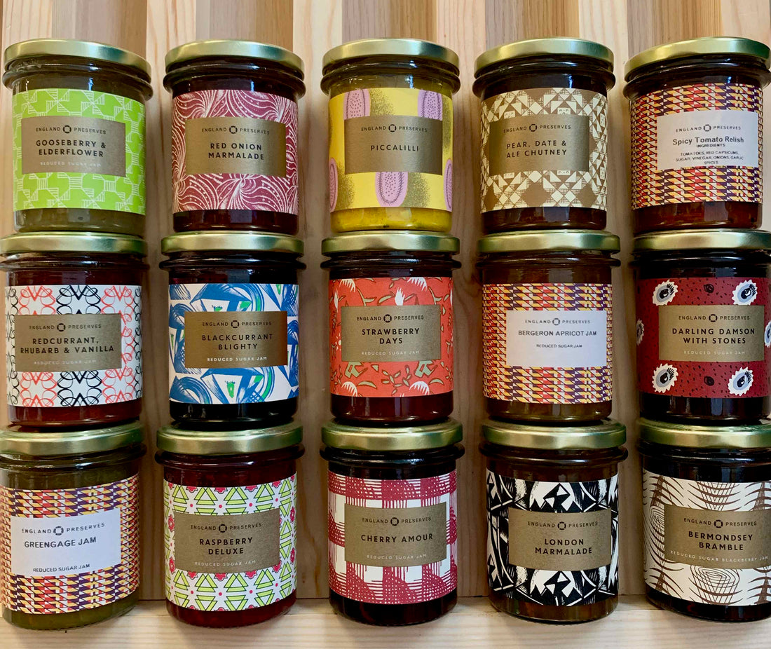
Nash (1889-1946) is considered to be one of the most important landscape artists of the 20th century, and a key figure in the rise of Modernism in English art. It was during his time as a teacher at the Royal College of Art that he met his students Eric Ravilious and Edward Bawden. Nash's woodcut self-portrait (1922) is reminiscent of the design that is used as the label for our London Marmalade. The design is Sky's favourite. "Considering it was designed in the early 20th Century," she says, "it looks so modern." He's considered one of the godfathers of Modernism for a reason.
Ravilious (1903-1942), an acolyte of the British countryside who is particularly known for watercolours of British landscapes, posthumously stars on Twitter. During lockdown in 2019, @Ravilious1942 began posting daily paintings by the late British artist, earning him countless new fans. Those semi-circle blue swirls and splashes of green that make our Blackcurrant Blighty label are typical of Ravilious' pastoral tendencies. It is one of our most beloved jams, and the label is a big reason why.
Both our Bermondsey Bramble and Redcurrant, Rhubarb & Vanilla labels were designed by Edward Bawden (1903-1989). Bawden's impressive portfolio includes illustrations for leading companies like London Transport, Twinings, and Penguin Books, as well as posters and garden metalwork furniture. If you'd like to see Bawden's work in the flesh, see his tile work depicting a foot ferry on the River Lea on the Victoria line platform at Tottenham Hale tube station.
The former Royal College of Art trio worked together one day a week for the Curwen Press by 1930. Nash went on to describe the pair as "an extraordinary outbreak of talent."
Fancy trying these jams? See the links below: |
An (Almost) Forgotten Master: E.O. Hoppé

Laura Cumming describes the great portrait photographer E.O. Hoppé as "intensely famous in his own time, almost forgotten in ours." You'd be forgiven, then, if you'd not heard of him.
In his heyday, Hoppé hopped from place to place, relentlessly following his curiosity. He was exceptionally interested in people and the diversity of social behaviour. As Cumming explains, he camped with Romanian gypsies, dwelled with Australian aborigines, photographed members of the royal family and disappeared for months on end to capture life in unfamiliar nations. It is perhaps this diversity, this profusion of characters and settings, that makes E.O. Hoppé's work inconspicuous. There was no set style. No quintessential Hoppé aesthetic. He embraced difference so keenly, yet captured humanity with such clarity.
Hoppé, despite his popularity, shied away from the limelight. In 1954, the German-born, London-based photographer disappeared from the public eye after selling five decades of his work to a London picture library at the age of 76.
His pictures, which gained him a reputation as one of Britain’s most influential international photographers for decades, joined the ranks of what’s known as “stock” photos, which aren’t searchable by name
To us, he's the summery sparkle behind our Strawberry Days and Gift Boxes. Hoppé's pattern may not feature the human face, but - like his photography - it perfectly captures something beautiful: picnics in the park, glasses of fizz, afternoon tea, strawberry jam.
E.O. Hoppé's jam: |
At the Frontier of Font: Elizabeth Friedländer and Harry Carter
If Hoppé is considered a forgotten figure, the name on our Cherry Amour label, Carter, hides in plain sight every day.
Harry Carter (1901-1982) was an English typographer, translator and writer. While writing for the Fine Press Book Association, Michael Barnes admits that he seldom buys a book "because it was written by Harry Carter," but his name "crops up discreetly" in lots. For Carter, this is not about under-appreciation but rather an appreciation of going about his work quietly. Carter preferred to remove himself from the limelight. He became friends and colleagues with Stanley Morison, creator of Times New Roman, and assisted him on his John Fell (1967) book. Carter's contribution was so significant that Morison was willing to list him as the principal author; Carter refused, and his name displays discreetly, as 'assistant' on the title page.
Even today, the Carter name hides in plain sight. Harry's son, Matthew, has been described as "the most widely read man in the world." This is not because he authors books read in schools, nor does it mean he's read more than anyone else. It is because he is the designer of some of the most widely used digital fonts: Verdana, Georgia, and Tahoma stand out among many others.
Elizabeth Friedländer (1903-1984), designer of our Raspberry Deluxe, also survives through a popular font. A designer of book jackets, logos, and calligraphy, Friedländer designed the typeface 'Elizabeth', which is still used digitally today.
We love Friedländer's vibrant pink and green geometric design that adorns our Raspberry Deluxe. The acidic green encapsulates the sourness of raspberries perfectly.
Fancy trying these jams? See the links below: |
Chosen then Chucked by Churchill: Graham Sutherland
When selecting the design for our Piccalilli, we needed something that would be as striking as the relish itself. Oh, and it needed to be yellow. Graham Sutherland's (1903-1980) dazzling yellow and pink pattern that graces our Piccalilli is as vibrant and energising as the piquant, mustardy pickle.
Sutherland is another of the more famous names found on our jars. A prolific painter, Sutherland spent much of his career as a reputable portrait artist. Perhaps the most high-profile portrait in Sutherland's portfolio is of the Prime Minister Winston Churchill.
The portrait was presented to Churchill on his 80th birthday ceremony in Westminster Hall, during his second tenure as Prime Minister. Churchill deeply disliked the portrait. He found it unflattering and complained that it made him "look like a down-and-out drunk who had been picked out of the gutter of the strand."
Sutherland maintained that his depiction was simply a recreation of how he saw the Prime Minister at the time of painting. However, Churchill was not easily persuaded. The portrait was taken back to his home, Chartwell, where it was eventually destroyed on the command of Lady Spencer-Churchill not to disturb her husband. The artist condemned the destruction of his painting, listing it as an act of vandalism. It did not, however, put off future high-profile clients from commissioning Sutherland. He became an unofficial state portrait painter after the Churchill incident, going on to paint the Queen Mother and Konrad Adenauer, among others.
Piccalilli is perhaps our most divisive product. So too, clearly, was Sutherland's work, making him the perfect designer for our sharp, crunchy (but ultimately delicious) pickle.

The Rest Are The Best: Calkin James, Lowinsky, Nechamkin & Wilbraham
One of the wonderful things about the Press was its faithful support of independent and up-and-coming artists. While figures like Nash, Ravilious, Bawden & Sutherland went on to have renowned careers, many of the Press' employees never achieved the same recognition. Despite this, many artists who worked for the Press were quiet masters, diligently pursuing their craft and achieving excellence in the shadow of the spotlight.
Take Sarah Nechamkin (1917-2017), for example. Her eye-catching design on our Darling Damson jars (which literally looks like an eye) is representative of her vibrant designs, which made their way onto many book jackets, including a selection of poems by Byron published by Penguin, but her name is largely unknown.
Or Thomas Lowinsky (1872-1947), whose prestigious education at Eton, Trinity College, Oxford, and later the Slade School of Fine Art, propelled him into an excellent yet modest career as a portrait painter. His pattern for our Gooseberry & Elderflower jam shimmers like a gooseberry bush shifting in the breeze of a warm summer's day. We also use one of Lowinsky's patterns on our Pear, Date & Ale Chutney.
Margaret Calkin James (1895-1985) opened her gallery in 1920. Named The Rainbow Workshops in Bloomsbury, Margaret's gallery was one of the first to be started by a woman. Her beautiful design dutifully decorates all of our seasonal preserves, such as English Apricot, English Greengage, Blood Orange & Campari Marmalade, and Sicilian Grapefruit Marmalade. Calkin James suffered a stroke in the late 1960s. However, her stoic character left her undaunted by her paralysis, as she started a series of wool embroidery designs using her functioning left hand.
Sadly, there is little information out there on Diana Wilbraham, designer of our Red Onion Marmalade. Calling back to Hardy's quote, sometimes language arises without the use of words but through the eye. The beautiful pattern Wilbraham designed perfectly describes our Red Onion Marmalade. We're honoured to share her name with our customers and to celebrate her outstanding work.
Fancy trying these jams? See the links below: |
A Final Note
If you've loved learning more about the artists behind our label designs, be sure to check out The Curwen Studio. Originally founded as a subsidiary of the Curwen Press in 1958, the workspace continues to tell the Press' story, and, more importantly, provides independent artists with the facilities to create beautiful work and kindle their passions.